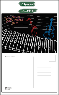
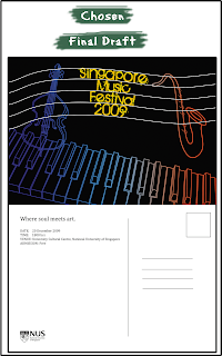
In the second class for visual elements and principle design, Dr Julian taught us colours; colour basics, colour contrast and colour harmony, and colour psychology. I understood why I had to use RGB for web designs and CMYK for print (additive and subtractive), the difference between saturation (think: shade) and hue (think: colour), and The Colour Wheel.
In the softwares, I used the colour swatches to apply different colour schemes to my designs.
Brief
§
Design a postcard about a music festival without the use of photographs and explore different colour schemes.
Objective:
– Developing necessary skill in using colour palette
– Developing necessary techniques in communicating the message through colours
– Understanding process of colour scheme selection and usage
Objective:
– Developing necessary skill in using colour palette
– Developing necessary techniques in communicating the message through colours
– Understanding process of colour scheme selection and usage
I was very keen on using the outlines of musical instruments for my postcard because of simplicity and serenity that music provides.
I picked three musical instruments: a piano, a cello and a saxophone because they are classical and common musical instruments.

What I did:
I put together the outlines of a piano, cello, saxophone and a music score to my design. I chose design 5 as the final piece.
- I ran out of colour schemes to try out (at least the colour schemes that I thought suited the design and theme). Therefore, I experimented with changing the background colour.
- I wanted to have gradient fills for some of the outline but was not sure as to how to go about doing it.
- Decrease the outline for the piano
- Try more colour schemes
- Increase contrast of colours
- The back design of the postcard could include more details such as the time and date of the festival.

- For designs 1-3, I added fills for the instruments.
- For designs 4-6, I added fills for the piano.
- For designs 7-9, I changed the backgrounds.
- For designs 10-12, I added gradient for the outline.
- Added time and date details for the festival on the back of the postcard.
- For designs 10-12, I figured out how to achieve the gradient outline effect. I copied the white paths from Illustrator onto Photoshop, used Magic Wand to delete the white outline, used a rectangle tool to create a gradient background and arranged the layers so that the gradient would appear behind the now-empty white outlines.


No comments:
Post a Comment