In Lecture 4, Dr Julian taught abstraction and representational techniques. In class, we did a practice on types of representation, mainly iconic and indexical signs. We also learnt abstraction, where we use the image of an object and gradually decrease the degree of fidelity to turn it into a more schematic representation. This is usually done by omitting details of the object to transform it into a general representation of the certain object type.
Brief
I have to select a location in Singapore and create a representative image of it (i.e. take a photo of the actual building or an indexic representation of it) to develop it into a symbol. Then, I have to distill the image through a process of abstraction (at least 5 levels) on A3. At the last point of abstraction, I will be left with a symbol of the location or place that I have initially chosen. The longest side of the symbol has to be 15cm.
Objectives:
- Understanding and overcoming constrains/ problems of representation
- Developing skills in controlling visual message
I had a few ideas for places of interest.
- Raffles Hotel (Could not decide which side will be most representative)
- Haw Par Villa (Dragon? Entrance?)
- Jurong Bird Park (The logo is very abstract)
- Singapore Flyer (Logo is very abstract. Risk of copying.)
Finally, I decided to use Haw Par Villa for this assignment.
Design process
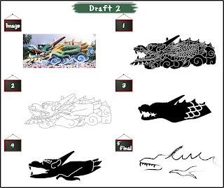
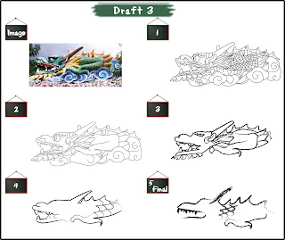
- Traced the outlines from the picture of the dragon.
- Gradually removed the scales and features of the dragon.
- Number 3 looks like a wolf. Number 4 looks like a gargoyle.
Despite my dissatisfaction with abstraction 3 and 4, my tutorial mates preferred the abstractions the most.

Changes I made: I decided to change the last abstraction and use a calligraphic brush to enhance the Oriental feature of the design.
Feedback:
- My tutorial mates still preferred abstraction 3 and 4.
- Suggested that I change the colour of all abstractions into black outlines to make it consistent.
Feedback from tutor:
- The scales can be gradually removed from the first abstraction onwards.
- Change all to normal strokes and send the softcopy to her (together with the original piece) for approval. The calligraphy brush looks like a hand-drawn sketch.


No comments:
Post a Comment