
Lecture 6 introduces us to visual elements and interaction to create a poster. In the principles of interaction, there are contras, unity, harmony and economy. Unity can be achieved through repetition, rhythm, shape and/or value. After unity is achieved, contrast can be added to bring the viewer's attention to the subject. Contrast can be achieved through composition, value, size and/or shape. Next, there is harmony through visual balance and weight. For example, if there are two subjects in the picture, I would want the images to be arranged in a way that communicates my message clearly and not put it off-balance. Finally, I can apply economy by using only elements that are needed and minimising distractions from the picture.
Brief
I have to design an A3 poster to promote active ageing using the principles of design that I have learnt so far. I can include a slogan and copy for my poster.
Objectives:
- Understanding the importance of basic visual elements and design principles in communicating a message - Developing necessary techniques to communicate the message through form
I tried to think of activities that senior citizens engage in. From my observations, I have seen them doing brisk walks, tai chi, singing karaoke, gathering for festivals, etc. I have two main ideas for my theme.
First idea is to create an extreme activity and have a grandmother as the subject. The poster would target the young crowd who would recognise the extreme activities. Hence, the slogan and copy would be directed at them.
The second idea is to target the senior citizens and encourage them to participate in activities that would entice them and show them the social aspects of these activities.

- Granny singing onstage in front of the crowd. Spotlight is on her and it is her moment of glory.
- Grandpa skateboarding. Slogan idea: "Can your Grandpa beat this?"
- Supergran killing a villain in a cartoon scene.
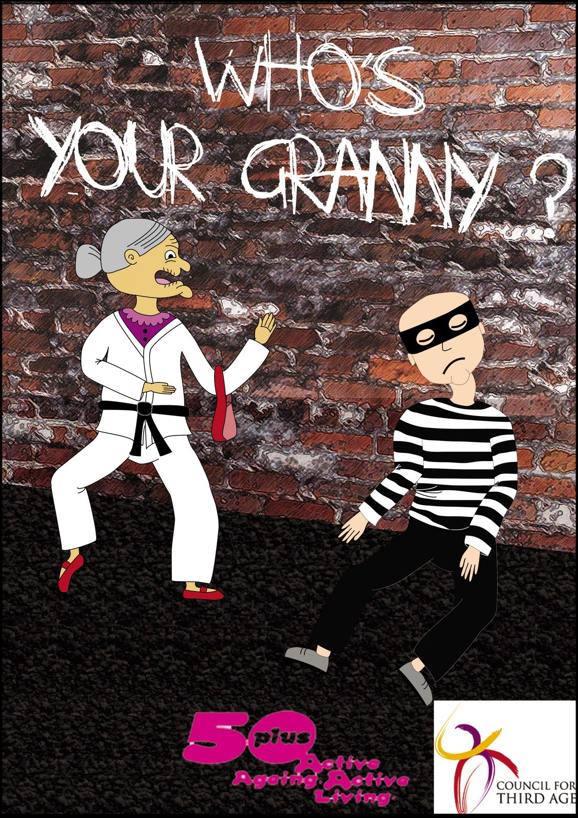
- Granny in karate suit and hurting a robber in a dark alley. Slogan idea: "Who's your granny?"
I decided to develop the last concept because it has a humorous touch to it and I think it is more realistic to put the granny in a karate costume than on a skateboard. Also, I would like to target the younger crowd as it is easier to encourage them to bring along their grandparents for fun activities as the young generation are already involved in such activities. Furthermore, I can experiment with colours. Creating a poster targeted at the older generation will look more dull and boring, I feel.
Draft 1
- I took images of a wall and asphalt road and added filters to them to make them cartoon-like.
- I created images of Granny and robber on paper, scanned and traced them on Illustrator.
- I did not add a copy to the piece because I wanted it to be a full visual image.
- I could not find a logo for Council for Third Age that is big enough for further development. Instead, I added the full logo into the poster.
- I could not omit the white spaces for the '50plus Active Ageing Active Living' logo with magic wand.
- Shift the granny more to the middle of the picture.
- Get rid of the white from the Council for Third Age logo.
- Add body copy.
- Change the outlines of the robber so that his pants would contrast against the black asphalt.
Draft 2

Feedback:
The second draft is better and preferred but the feedback from the previous on still remained.
Draft 3

- I added body copy.
- Shifted Granny and robber and put them a little closer.
- Modified the logo for Council for Third Age.
- Added black stroke to the headline to let it stand out.
- Changed Granny's clothes so that I can use the colours of the logo for the vibrant lines.
- Added shadows to the characters to let them stand out.
- Added white outlines for the robber's pants.
- Due to the design of the logo, it was hard to separate the white space completely. Also, it is hard to contrast the logo from the black asphalt. So, I added a white stroke to the design.
- Minimise the vibrant lines and add movement strokes instead.
- Change the asphalt design and have one that is lighter.
- Move the logo to the far left.
- Left-align the body copy.
Final Draft

Changes I made:
- Added movement strokes for three out of four limbs (the ones moving for karate movements)
- Lightened asphalt pattern by using a different image
- Moved the logo and left-aligned the body copy.
- Added a black stroke above the white stroke so that the logo would stand out further from the lightened asphalt.
- Added a white glow to Granny to provide more contrast
- Added a gradient overlay to the whole picture so that it resembles a dark alley
No comments:
Post a Comment