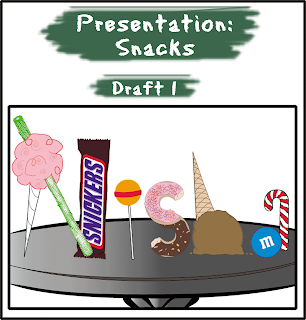
This week, I learnt about concept development (conceptualization and concept evaluation) and prototyping in the creative phase. Basically, this phase consists of:
- Conceptualization: brainstorming and thumbnail sketches
- Concept evaluation: rough sketches of chosen thumbnails
- Prototyping: developing the rough sketches into digital presentations
Brief
For Assignment 1, I have to select two words which best describe my character. The words could be about likes, dislikes, hobbies, or anything else that represents me. That is, word A and word B.
The procedure will go as such:
- Create 4 concepts for each word (manipulate the objects in the concepts into letters of my name)
- Choose one concept from each word and develop into two full-scale roughs (total four roughs)
- Choose one rough from each word and create a prototype
Objectives:
Understanding and internalizing… design process, idea generation techniques, basic production techniques
Interest:
1) Frequency: What would qualify as an interest? Does that mean that I do it often because I enjoy it, or have done it a few times, enjoyed it and would like to do it again?
2) Colourful: Whatever I pick has to be colourful. Bright, bold colours.
3) Workable: There should be enough items for me to work around with
The final list:
- Crafts
- Snacks
Design process

I decided to develop thumbnails #2 and #3 for both Crafts and Snacks into full-scale roughs.These are the scanned copies of the roughs:
After presenting the full-scale roughs in class, my tutorial mates suggested that I use certain elements (alphabets) in each rough for Crafts and merge them together. For Snacks, majority preferred Draft 1. They especially like the Snickers bar :)
I present the concepts for Snacks and Crafts separately so that you may see the development clearly.
Problems/Solutions:
- I could not find a font for the Snickers bar. So, I put a photo of a Snickers bar onto the file and traced the logo on Illustrator.
- Initially I wanted to put the items on a tray but I was worried that it might not look like a tray. So, I chose to use a table instead. I could not find a suitable table that I liked, so I stuck to tracing a clipart of a table.
- The table could look a little better. Some thought it was a tray.
- The items could look like they were lying on the table instead of standing upright on it. It would look more realistic.
- The ice cream does not look very much like the letter H.
- I traced the pattern of wood for the table and changed the colour against the ice cream cone so that the colours will not clash.
- I changed the flavour of the ice cream from chocolate to vanilla so that it would stand out from the table. I added a thick stroke for the outline of the ice cream to bring out the 'h'.
- Finally, I added shadows to all alphabets to show that they are resting on the table.
What I did:
I made some changes to the final piece and used letters from different roughs to create my prototype.
N - ruler and safety pin
I - keep the thread in Draft 1
S - keep the tube in Draft 1
H - change the H (later I decided to use a penknife and heart origami since a penknife is not anywhere else in the design)
A - keep the button and paper clips in Draft 2
I placed the letters against pieces of coloured paper to emphasize the concept.
- I was not too sure about drawing the vectors for the safety pin to give the most accurate presentation. Hence, I traced the outlines of a clipart of a safety pin.
- I had some problems making the origami look the way I wanted it to because the outlines and the colour made it look like a custom shape from a software. So, I added a gradient to make it more vibrant, thicken the outlines and expanded the sides to show the folds of an origami.
Feedback:
- The 'h' does not look like one.
Otherwise, my tutorial groupmates liked the outcome and had no further suggestions for this piece. Since I changed the background for the final presentation of Snacks, I decided to add a table for the final presentation of Crafts too.


No comments:
Post a Comment