Project Work

For the final project, we had to work in a team to produce a children's storybook.

Firstly, we had to come up with a storyline each (a brainstorming process) and draw an example of the characters that we have in our storyline. Secondly, we have to choose a story and develop it into a full story, complete with all characters and pictures.

For my outline, I worked on a story that I heard a long time ago about a girl who gave flower petals to her father.

The original story:
One day, a girl was walking in the garden and saw a lone rose flower. She thought it was very beautiful. "It would be a perfect gift to give to Papa to tell him how much I love him." As she also wanted to have the flower to herself, she decided not to give her father the whole flower. Instead, she gave him a petal everyday. Each day, she would say,"Papa, this is a present for you. I love you." Her father would just take it, thank her and keep it in his pocket, saying, "I'll keep it near my heart, my princess". One day, the girl realised that there was only one petal left to the flower. She cried and went to her father. "Papa, I am sad. There is only one flower petal left. I want to give it to you but then I would not have any more for myself." The father said,"My princess, I have kept every flower petal you gave me. Although I know you wanted to keep some of it for yourself, I know you love me more than that, that's why you gave me one each day. And because you love me that much, I'll share these flower petals with you."

I liked the idea of having a fairy in the story. It reminds me of a true fairytale for a child. Something dreamy and fantasy.

My developed story:
In a faraway land lives a little fairy called Fred.
He lives with his mother, Mummy Lina, and his grandmother, Granny Mary.
Granny Mary is always a little forgetful and careless sometimes.
She always sat on a small mushroom outside the house, staring into the fields.
Fred does not like Granny Mary very much because she wasn't fun to play with.
After school, Fred would fly home with his little wings and go straight to his room, leaving Granny Mary outside.
He does not understand why she always looked so sad.
One day, there was a little red flower petal outside his room.
For weeks, there was a flower petal outside his room each day.
He collects them all but he never found out where it came from.
Granny Mary fell ill and had to stay in bed. Mummy Lina asked Fred to talk to Granny Mary.
While he sat beside her bed, Granny asked,"Did you like the flowers my dear? I wanted to give you a flower everyday that I loved you more and wished you would talk to me. But I was not strong enough to bring the whole flower. But I hoped you kept each petal that I sent with love."
Fred cried and hugged Granny Mary.
From then on, Fred promised to keep Granny Mary company forever and ever.


Project:
The group decided on my story and improving it by adding details from other stories into mine.

We decided to add rhymes for the story to make it fun for children to read. Hence, I worked on creating the rhymes according to the layout so that each page would have four lines of poem.

The final version of the story:

Once upon a time in a faraway land.
Nature’s Blossom the fairies’ den
Where fairies of all sizes come together
To make the world a little better

In a tiny cottage that is most charming
Lived little Elvin who loved singing
Mummy Ordelia likes to make chocolate
Granny Rosalia likes to keep quiet

Elvin loves Mummy Ordelia the most
Because every morning she would make him French toast
For him she would cook, she would boil and bake
Even make him his favorite kind of cake

Louis was next in the line
The dearest friend Elvin could find
Flying together from one place to another
They would play and sometimes race each other

Elvin and Louis go to LilyBellMusicSchool
Where they gather with the birds by the pool
Creating music with their magical wands
They played from evening all the way till dawn

But Elvin loves Granny Rosalia the least
She always looks sad, and never looks pleased
Sitting on her mushroom everyday
Elvin wouldn’t dare to ask Granny to play

One day, Elvin found out with glee
That the magical music festival would be
Hosted in nature’s blossom soon
And he had been chosen to sing a tune

Elvin had not used his wand before
To make music for fairies whom he didn’t know
He was so excited to be performing
So he told everyone whom he met that morning

Looking around his room the next day
Elvin saw a flower petal, there it lay
And in that week every morning to come
There was a petal just like the very first one

Elvin was thankful and Elvin was pleased
So he went to Mr Birdie’s home in the trees
“Thank you very much Mr Birdie” said he
But Mr Birdie told Elvin “the gifts aren’t from me”

“Then it must be Mr Windy” thought Elvin
So he went to his home in the hills to find him
“Thank you very much Mr Windy” said he
But Mr Windy told Elvin “the gifts aren’t from me”

“Then it must be my friend Louis” thought Elvin
So he went to Lilybell music school to find him
“Thank you very much Louis” said he
But Louis told Elvin “the gifts aren’t from me”

While Elvin performed his favorite song
He saw Granny dragging a petal along
How could it have been Granny all this time?
How could Granny have been so kind?

So Elvin found Granny after the show
And asked her what he wanted to know
Granny just looked at Elvin and smiled
Then said “did you like the flower my child?”

“I want you to know that I’m proud of you”
“And the flower represents my love so true”
“The flower was too heavy to carry alone, son”
“That is why I gave you petals one by one”

Elvin cried and hugged Granny tight,
And then he promised the stars that night
That from then on he would love Granny Rosalia
As much as he loved Louis and Mommy Ordelia


Assignment 5 - Music Festival Postcard

In the second class for visual elements and principle design, Dr Julian taught us colours; colour basics, colour contrast and colour harmony, and colour psychology. I understood why I had to use RGB for web designs and CMYK for print (additive and subtractive), the difference between saturation (think: shade) and hue (think: colour), and The Colour Wheel.

In the softwares, I used the colour swatches to apply different colour schemes to my designs.

Brief
§

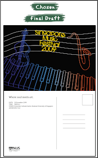
Design a postcard about a music festival without the use of photographs and explore different colour schemes.

Objective:
– Developing necessary skill in using colour palette
– Developing necessary techniques in communicating the message through colours
– Understanding process of colour scheme selection and usage


Thought process
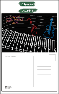
I was very keen on using the outlines of musical instruments for my postcard because of simplicity and serenity that music provides.

I picked three musical instruments: a piano, a cello and a saxophone because they are classical and common musical instruments.

Design process
What I did:
I put together the outlines of a piano, cello, saxophone and a music score to my design. I chose design 5 as the final piece.

Problems/Solutions:
  • I ran out of colour schemes to try out (at least the colour schemes that I thought suited the design and theme). Therefore, I experimented with changing the background colour.
  • I wanted to have gradient fills for some of the outline but was not sure as to how to go about doing it.
Feedback:
  1. Decrease the outline for the piano
  2. Try more colour schemes
  3. Increase contrast of colours
  4. The back design of the postcard could include more details such as the time and date of the festival.


Changes I made:
  • For designs 1-3, I added fills for the instruments.
  • For designs 4-6, I added fills for the piano.
  • For designs 7-9, I changed the backgrounds.
  • For designs 10-12, I added gradient for the outline.
  • Added time and date details for the festival on the back of the postcard.
Problems/Solutions:
  • For designs 10-12, I figured out how to achieve the gradient outline effect. I copied the white paths from Illustrator onto Photoshop, used Magic Wand to delete the white outline, used a rectangle tool to create a gradient background and arranged the layers so that the gradient would appear behind the now-empty white outlines.

Assignment 4 - Active Ageing Poster Design

Lecture 6 introduces us to visual elements and interaction to create a poster. In the principles of interaction, there are contras, unity, harmony and economy. Unity can be achieved through repetition, rhythm, shape and/or value. After unity is achieved, contrast can be added to bring the viewer's attention to the subject. Contrast can be achieved through composition, value, size and/or shape. Next, there is harmony through visual balance and weight. For example, if there are two subjects in the picture, I would want the images to be arranged in a way that communicates my message clearly and not put it off-balance. Finally, I can apply economy by using only elements that are needed and minimising distractions from the picture.

Brief

I have to design an A3 poster to promote active ageing using the principles of design that I have learnt so far. I can include a slogan and copy for my poster.

Objectives:
- Understanding the importance of basic visual elements and design principles in communicating a message - Developing necessary techniques to communicate the message through form

Thought process
I tried to think of activities that senior citizens engage in. From my observations, I have seen them doing brisk walks, tai chi, singing karaoke, gathering for festivals, etc. I have two main ideas for my theme.

First idea is to create an extreme activity and have a grandmother as the subject. The poster would target the young crowd who would recognise the extreme activities. Hence, the slogan and copy would be directed at them.

The second idea is to target the senior citizens and encourage them to participate in activities that would entice them and show them the social aspects of these activities.

Design process


  1. Granny singing onstage in front of the crowd. Spotlight is on her and it is her moment of glory.
  2. Grandpa skateboarding. Slogan idea: "Can your Grandpa beat this?"
  3. Supergran killing a villain in a cartoon scene.
  4. Granny in karate suit and hurting a robber in a dark alley. Slogan idea: "Who's your granny?"
I decided to develop the last concept because it has a humorous touch to it and I think it is more realistic to put the granny in a karate costume than on a skateboard. Also, I would like to target the younger crowd as it is easier to encourage them to bring along their grandparents for fun activities as the young generation are already involved in such activities. Furthermore, I can experiment with colours. Creating a poster targeted at the older generation will look more dull and boring, I feel.

Draft 1
What I did:
  • I took images of a wall and asphalt road and added filters to them to make them cartoon-like.
  • I created images of Granny and robber on paper, scanned and traced them on Illustrator.
  • I did not add a copy to the piece because I wanted it to be a full visual image.
Problems/Solutions:
  • I could not find a logo for Council for Third Age that is big enough for further development. Instead, I added the full logo into the poster.
  • I could not omit the white spaces for the '50plus Active Ageing Active Living' logo with magic wand.
Feedback:
  1. Shift the granny more to the middle of the picture.
  2. Get rid of the white from the Council for Third Age logo.
  3. Add body copy.
  4. Change the outlines of the robber so that his pants would contrast against the black asphalt.
Draft 2
Draft 2 is similar to Draft 1 and presented on the same day. I added coloured lines behind Granny to add vibrance to her character.

Feedback
:
The second draft is better and preferred but the feedback from the previous on still remained.

Draft 3
Changes I made:
  • I added body copy.
  • Shifted Granny and robber and put them a little closer.
  • Modified the logo for Council for Third Age.
  • Added black stroke to the headline to let it stand out.
  • Changed Granny's clothes so that I can use the colours of the logo for the vibrant lines.
  • Added shadows to the characters to let them stand out.
  • Added white outlines for the robber's pants.
Problems/Solutions:
  • Due to the design of the logo, it was hard to separate the white space completely. Also, it is hard to contrast the logo from the black asphalt. So, I added a white stroke to the design.
Feedback:
  1. Minimise the vibrant lines and add movement strokes instead.
  2. Change the asphalt design and have one that is lighter.
  3. Move the logo to the far left.
  4. Left-align the body copy.

Final Draft
Changes I made:
  • Added movement strokes for three out of four limbs (the ones moving for karate movements)
  • Lightened asphalt pattern by using a different image
  • Moved the logo and left-aligned the body copy.
  • Added a black stroke above the white stroke so that the logo would stand out further from the lightened asphalt.
  • Added a white glow to Granny to provide more contrast
  • Added a gradient overlay to the whole picture so that it resembles a dark alley

Assignment 3 - U C What I See

Brief

In Lecture 5, we explored deeper into representational techniques, specifically on creating visual content using image creation tools. We dealt with constraints (perception, picture frame) and composition (rule of thirds, point of focus) because we would be working with cameras for our next assignment.

We had to create a visual narrative using less than 10 pictures shot from a camera, with minimum graphic manipulation. First, I had to jot down ideas for the story. Second, I had to create a storyboard to get my plan on paper. Third, I must shoot the scenes. Lastly, work on the digital images to enhance them.

Thought process
I wanted something as witty and humorous as the 'Revenge of the Strawberries' example provided by Dr Julian during the lecture. I wanted something with a twist too.

At first, I though of replacing the strawberries and orange with other fruits but it seemed to close to the example given. I tried developing the story further too but I did not like the outcome. Finally, I decided to work on a suicide story.

A girl seems depressed and suicidal. The viewers are led to believe that she was going to commit suicide. In the end, it turns out that she was only throwing away her stuffed toy out the window and was upset about it.

Design process


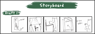
Storyboard:
  1. The reflection of a girl hugging her knees on the floor, seemingly depressed. The words "I'm sorry" are written in red on the mirror. There is a red stuffed toy beside her.
  2. Shot of a chair by the window. Taken from low angle shot to convey a potential danger or trouble.
  3. Girl stepping on chair.
  4. High angle shot from top of building to the bottom. Blur out image to create downward motion.
  5. Elmo at the bottom.
Problems/Solutions:
  • I could not access a tall building from which I could take a picture from for shot #4. So I went on alternate floors and took several photos and merge them together to create more depth in the photo.
Feedback:
While most anticipated that the girl was going to commit suicide and saw the twist with the stuffed toy, they could not understand why the outcome was such. They suggested that I add a scene or two to explain why the toy was thrown out.

So, I came up with the second draft. This time, I added a scene before the first one and modified the last scene.


Modified storyboard:
  1. A note pasted on the door from the boyfriend. It says: "I'm sorry. We can't go out anymore. I love somebody else. From, Me. Sorry."
  2. The reflection of a girl hugging her knees on the floor, seemingly depressed. The words "I'm sorry" are written in red on the mirror. There is a red stuffed toy beside her. At this point, it should be clearer that she is upset about the note from the previous scene.
  3. Shot of a chair by the window. Taken from low angle shot to convey a potential danger or trouble.
  4. Girl stepping on chair.
  5. High angle shot from top of building to the bottom. Blur out image to create downward motion.
  6. Elmo at the bottom. A thought bubble is beside Elmo which shows the toy sitting up with a note in front of him. It says: "Surprise! I hope you like the gift. I love you. Forever. Love, Me." Now, it is clear that the gift was from the boyfriend and once he left her, she threw away the doll.

Assignment 2 - Pictogram

In Lecture 4, Dr Julian taught abstraction and representational techniques. In class, we did a practice on types of representation, mainly iconic and indexical signs. We also learnt abstraction, where we use the image of an object and gradually decrease the degree of fidelity to turn it into a more schematic representation. This is usually done by omitting details of the object to transform it into a general representation of the certain object type.

Brief
I have to select a location in Singapore and create a representative image of it (i.e. take a photo of the actual building or an indexic representation of it) to develop it into a symbol. Then, I have to distill the image through a process of abstraction (at least 5 levels) on A3. At the last point of abstraction, I will be left with a symbol of the location or place that I have initially chosen. The longest side of the symbol has to be 15cm.

Objectives:
- Understanding and overcoming constrains/ problems of representation
- Developing skills in controlling visual message


Thought process
I had a few ideas for places of interest.
  • Raffles Hotel (Could not decide which side will be most representative)
  • Haw Par Villa (Dragon? Entrance?)
  • Jurong Bird Park (The logo is very abstract)
  • Singapore Flyer (Logo is very abstract. Risk of copying.)
Finally, I decided to use Haw Par Villa for this assignment.

Design process

What I did:
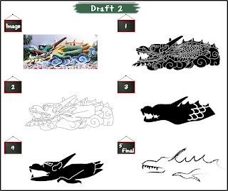
  • Traced the outlines from the picture of the dragon.
  • Gradually removed the scales and features of the dragon.
Problems/Solutions:
  • Number 3 looks like a wolf. Number 4 looks like a gargoyle.
Feedback:
Despite my dissatisfaction with abstraction 3 and 4, my tutorial mates preferred the abstractions the most.

Changes I made: I decided to change the last abstraction and use a calligraphic brush to enhance the Oriental feature of the design.

Problem/Solution: I tried changing abstractions 3 and 4 but none of the changes looked more like dragons. Hence, I kept it and concentrated on the final abstraction.

Feedback:
  1. My tutorial mates still preferred abstraction 3 and 4.
  2. Suggested that I change the colour of all abstractions into black outlines to make it consistent.
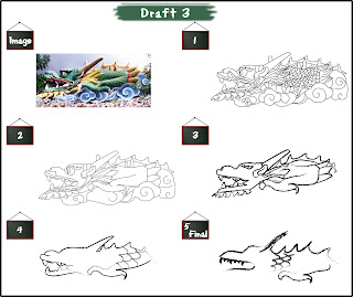
Changes I made: I changed all abstractions into black outlines with white fills. I did the abstractions 3 and 4 from scratch by copying the image from abstraction 2 and omitting elements.

Feedback from tutor:
  • The scales can be gradually removed from the first abstraction onwards.
  • Change all to normal strokes and send the softcopy to her (together with the original piece) for approval. The calligraphy brush looks like a hand-drawn sketch.
Changes I made: I added the scales and removed them gradually from each abstraction.

Changes I made: Changed the strokes and used calligraphy brushes on them.

Final:

Assignment 1 - Me, Myself and I

This week, I learnt about concept development (conceptualization and concept evaluation) and prototyping in the creative phase. Basically, this phase consists of:
  1. Conceptualization: brainstorming and thumbnail sketches
  2. Concept evaluation: rough sketches of chosen thumbnails
  3. Prototyping: developing the rough sketches into digital presentations
Brief

For Assignment 1, I have to select two words which best describe my character. The words could be about likes, dislikes, hobbies, or anything else that represents me. That is, word A and word B.

The procedure will go as such:
  1. Create 4 concepts for each word (manipulate the objects in the concepts into letters of my name)
  2. Choose one concept from each word and develop into two full-scale roughs (total four roughs)
  3. Choose one rough from each word and create a prototype
Objectives:
Understanding and internalizing… design process, idea generation techniques, basic production techniques

Thought process
I could not decide on any particular interest that I could possibly manipulate into taking the form of my name. Almost everything is possible, but which should I pick? In the decision-making process, there were a few criteria that I used to shortlist my choices.

Interest:
1) Frequency: What would qualify as an interest? Does that mean that I do it often because I enjoy it, or have done it a few times, enjoyed it and would like to do it again?
2) Colourful: Whatever I pick has to be colourful. Bright, bold colours.
3) Workable: There should be enough items for me to work around with

The final list:
- Crafts
- Snacks

Design process


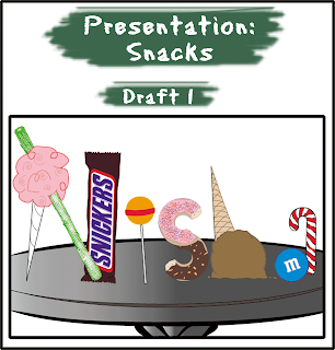
I decided to develop thumbnails #2 and #3 for both Crafts and Snacks into full-scale roughs.These are the scanned copies of the roughs:

After presenting the full-scale roughs in class, my tutorial mates suggested that I use certain elements (alphabets) in each rough for Crafts and merge them together. For Snacks, majority preferred Draft 1. They especially like the Snickers bar :)

I present the concepts for Snacks and Crafts separately so that you may see the development clearly.

What I did: I developed the prototype using Draft 1 and decided to put the items on the table to create a suitable environment for the presentation.

Problems/Solutions:
  • I could not find a font for the Snickers bar. So, I put a photo of a Snickers bar onto the file and traced the logo on Illustrator.
  • Initially I wanted to put the items on a tray but I was worried that it might not look like a tray. So, I chose to use a table instead. I could not find a suitable table that I liked, so I stuck to tracing a clipart of a table.
Feedback:
  1. The table could look a little better. Some thought it was a tray.
  2. The items could look like they were lying on the table instead of standing upright on it. It would look more realistic.
  3. The ice cream does not look very much like the letter H.

Changes I made:
  • I traced the pattern of wood for the table and changed the colour against the ice cream cone so that the colours will not clash.
  • I changed the flavour of the ice cream from chocolate to vanilla so that it would stand out from the table. I added a thick stroke for the outline of the ice cream to bring out the 'h'.
  • Finally, I added shadows to all alphabets to show that they are resting on the table.


What I did:
I made some changes to the final piece and used letters from different roughs to create my prototype.

N - ruler and safety pin
I - keep the thread in Draft 1
S - keep the tube in Draft 1
H - change the H (later I decided to use a penknife and heart origami since a penknife is not anywhere else in the design)
A - keep the button and paper clips in Draft 2

I placed the letters against pieces of coloured paper to emphasize the concept.

Problems/Solutions:
  • I was not too sure about drawing the vectors for the safety pin to give the most accurate presentation. Hence, I traced the outlines of a clipart of a safety pin.
  • I had some problems making the origami look the way I wanted it to because the outlines and the colour made it look like a custom shape from a software. So, I added a gradient to make it more vibrant, thicken the outlines and expanded the sides to show the folds of an origami.
Feedback:
  • The 'h' does not look like one.
Otherwise, my tutorial groupmates liked the outcome and had no further suggestions for this piece. Since I changed the background for the final presentation of Snacks, I decided to add a table for the final presentation of Crafts too.


Changes I made:
  • I copied the table pattern from the Snacks piece and changed the colour to show a desk.
  • I took out the white fill from the safety pin.
  • I changed colour of the origami and rotated the piece a little more to make the 'h' clearer.